
Upcoming Exhibitions
Picturing Color
November 12–December 8, 2026
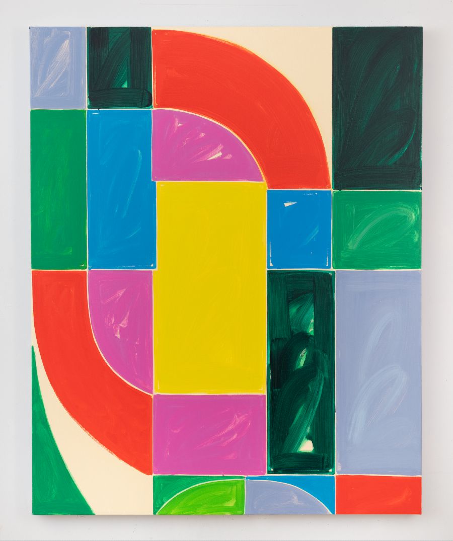
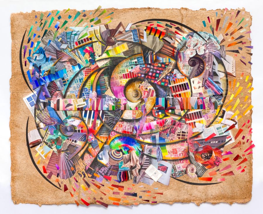
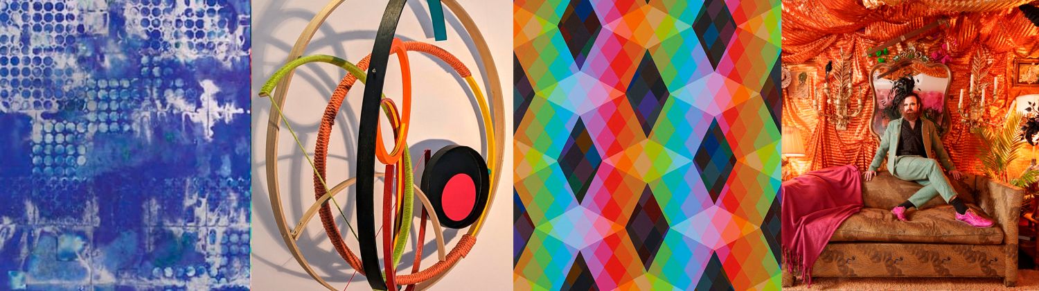
PICTURING COLOR: Artists Reveal the Spectrum, which follows PICTURING LIGHT (2024) and PICTURING SPACE (2019), is an exploration of the many manifestations of color. Color speaks to us on an emotional level—it hits us before we even know what we are looking at. The human eye experiences color in varying ways; it can spark physical and emotional responses, stimulating brain activity and altering our mood, while the meaning of color changes from one cultural context to another. PICTURING COLOR brings together the work of fine artists, photographers, graphic designers, and textile designers who respond to color in diverse ways. The specific focus of the show is on work that makes color its primary subject, not just the means to reveal other content. Some of the projects in this exhibition create environmental color experiences by layering transparent colors and by taking advantage of natural light in the Pomerantz lobby.
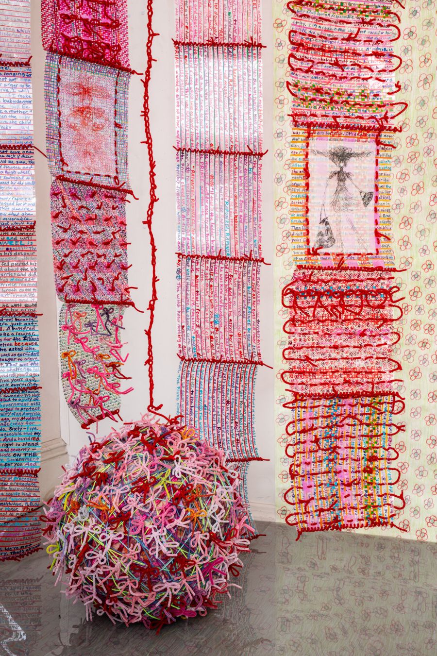
The exhibition PICTURING COLOR includes painting, sculpture, and site-specific installations in a wide variety of materials and media, including interactive displays that visitors can explore to see how our perception of color is influenced by lighting. The exhibit includes a selection of historic books on color theory from the collections of contributing artists Sanford Wurmfeld and Bascove, displayed on the wall and in vitrines in the back gallery.
The exhibit is organized around six key concepts:
Spectrum
Work which reveals the entire spectrum of visible light.
Monochrome
Work which focuses on one particular hue (including grayscale) and pushes the limits
of value and saturation.
The Cultural Meaning of Color
Work which explores the cultural connotations, symbolism, and emotional associations
of color.
Contrast
Work which uses strong hue contrasts, such as complementary colors, to create a dynamic
range of expression.
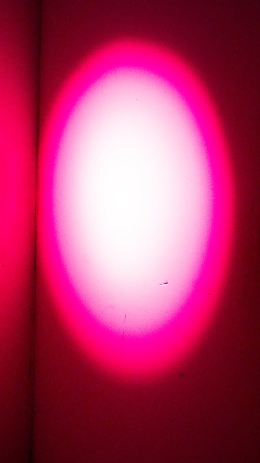
Saturation/Desaturation
Work which features highly saturated colors or very desaturated colors (or both) to
push color exploration.
Gradation
Work which employs a sequence of colors that gradually become lighter, darker, or
more saturated.
Professional artists who are engaged in color exploration have been invited to be part of this project. Some have created site-specific installations for the Art and Design Gallery. Contributions also come from current FIT students, faculty, and alumni from programs including Spatial Experience Design, Photography and Related Media, Communication Design, Textile/Surface Design, Color Science, and Fine Arts.
Public programs include a walk-through discussion with the artists, open to the FIT community, and a hands-on batik workshop with artist N’ketiah Brakohiapa.
Designers and artists make color choices for many reasons—to appeal to specific target audiences, to express concepts, to grab the attention of a distracted public, or simply to follow their own obsessions. PICTURING COLOR brings together a wide range of color experiences, from analytic to emotional to symbolic, and reattunes our sensibilities to the deeply meaningful ways that color affects all of our daily lives.
Picturing Color is curated and designed by Anne Finkelstein, adjunct associate professor, Spatial Experience Design.